call center pro
Monster UI application that enables businesses to efficiently configure, monitor, and own their call center experience.
- Information Architecture & Planning
- User Experience
- Interface Design
[OVERVIEW]
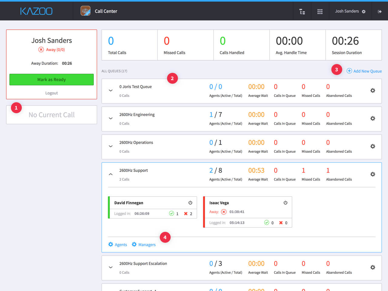
2600Hz had a MUI call center app in an early alpha stage with multiple early-adopter clients testing it in both development and small-scale production environments. The product team gained some valuable feedback and additional insight throughout this early testing phase, and we wanted to revisit and iterate on certain decisions that were implemented in the initial alpha version.
[LEARNING FROM FEEDBACK]
We kicked off with a brainstorming and planning session consisting of 2600Hz's CEO, CTO, Product Manager, and lead call center engineer addressing ideas and directions from the feedback we gathered from testing. There were a few points that we wanted to address specifically:
- The call details panel and agent status felt like a waste of space when there was no call occurring.
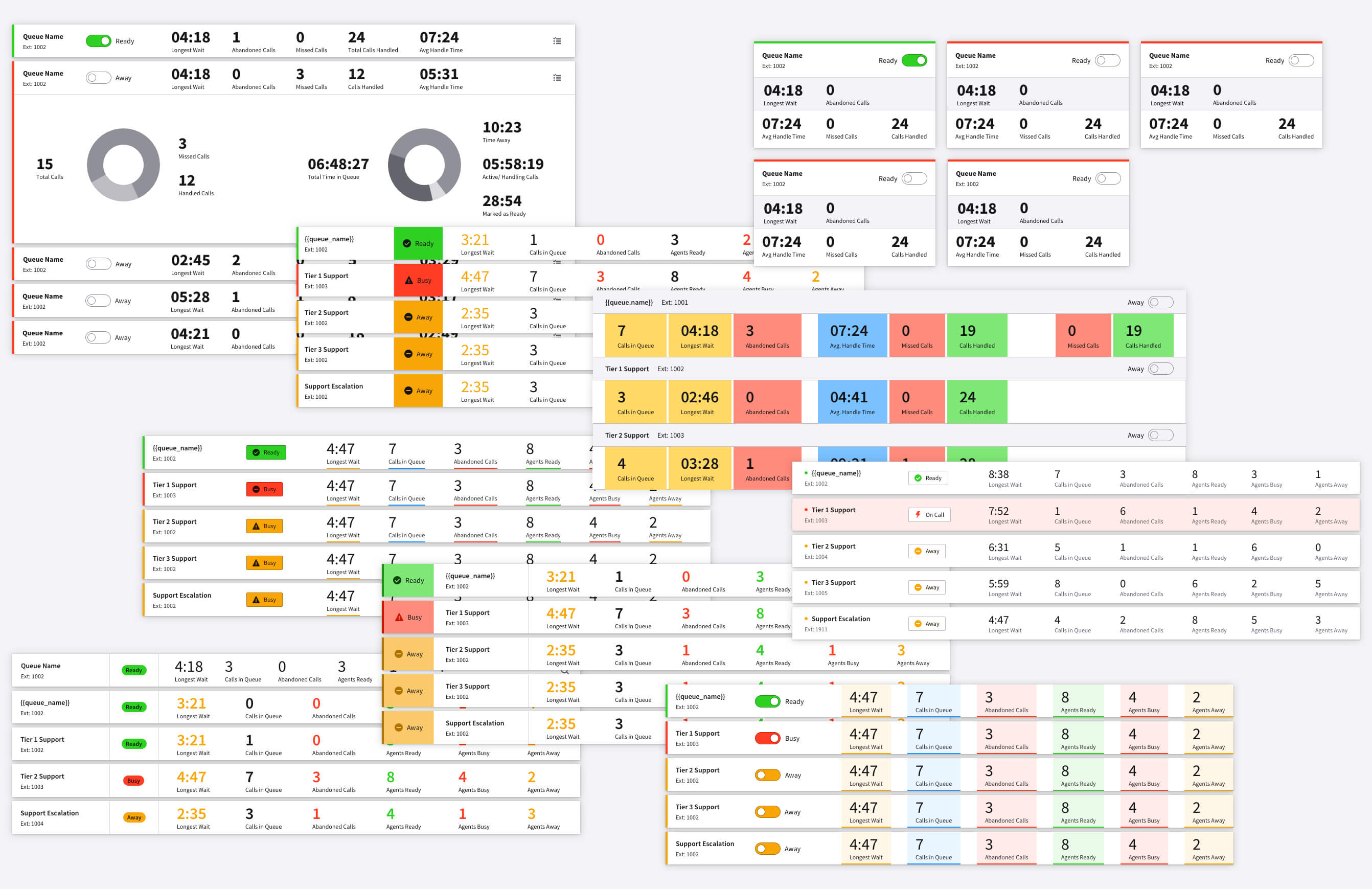
- Queues were somewhat hard to scan at a glance.
- Queue creation for Sys. Admins was leading to some confusion regarding the configuration options and their impact.
- Managers needed more enablement with queue/agent management and gathering perfomance feedback.
[User Profiles & Architecture]
Following our initial kickoff, I had another planning session with our Product Manager where we solidified a permissions heirarchy that contained 3 distinct user profiles: System Administrators, Managers, and Agents. We mapped functionality and updates to each profile, and wrote out user stories associated with them.
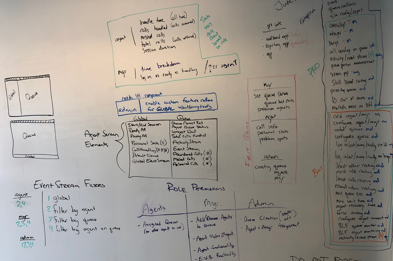
After all the brainstorming and planning, we centralized my tasks into three main objectives:
- • Design an improved experience that allows System Admins to configure queues and assign members as managers or agents.
- • Enable managers to access and manage queues, agents, activity logs, and performance.
- • Offer call center agents an experience that streamlines their daily workflows.
[Reworking Hierarchy & Layout]
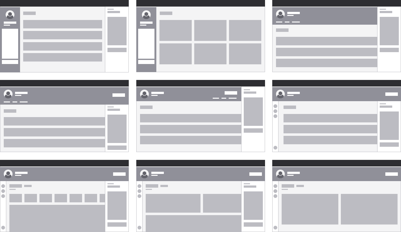
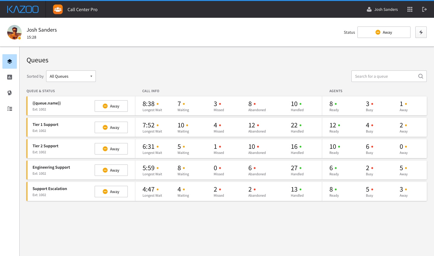
I focused first on revisiting the hierarchy and layout of the general interface. I wanted to address the feedback regarding the call details mechanism and the overall queue layout, which affected all 3 user profiles. I started exploring hierarchies by blockframing possible layouts for navigation and the queues listing view.
[Status control & Call handling]
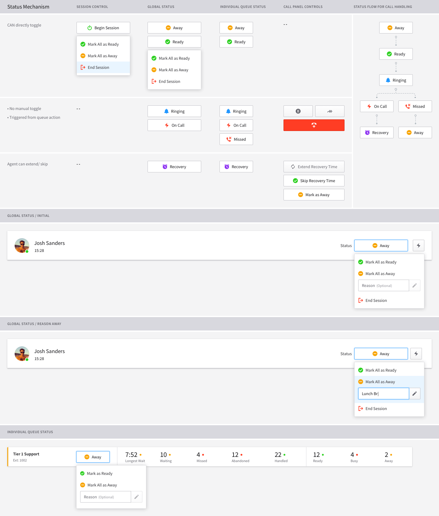
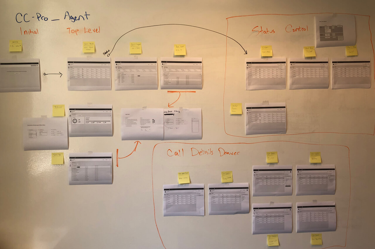
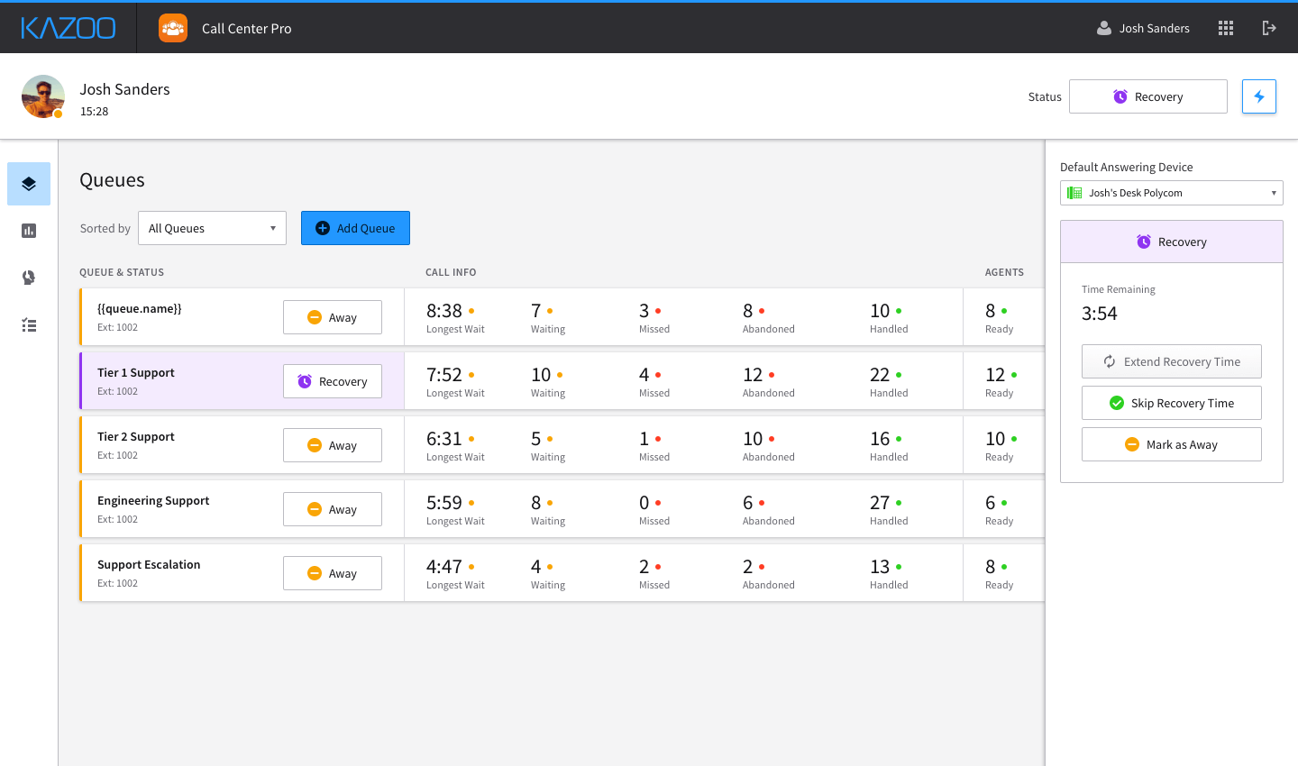
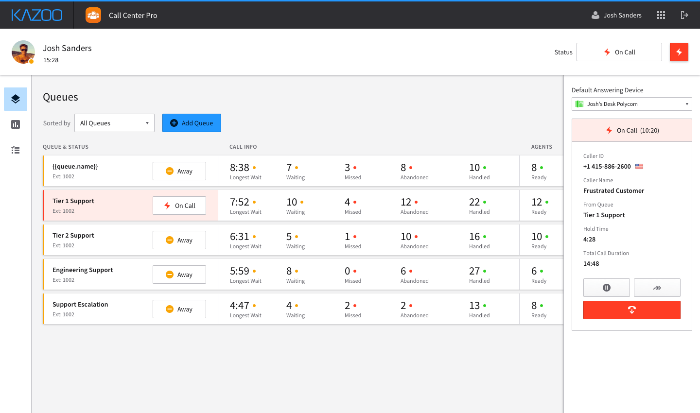
With the issues surrounding the queues listing view addressed, I shifted focus to other layout issues concerning the alpha version: the agent status control mechanism and the call details panel. Both components were taking up a third of the screen space while in the non-active state, which was something I wanted to revisit.
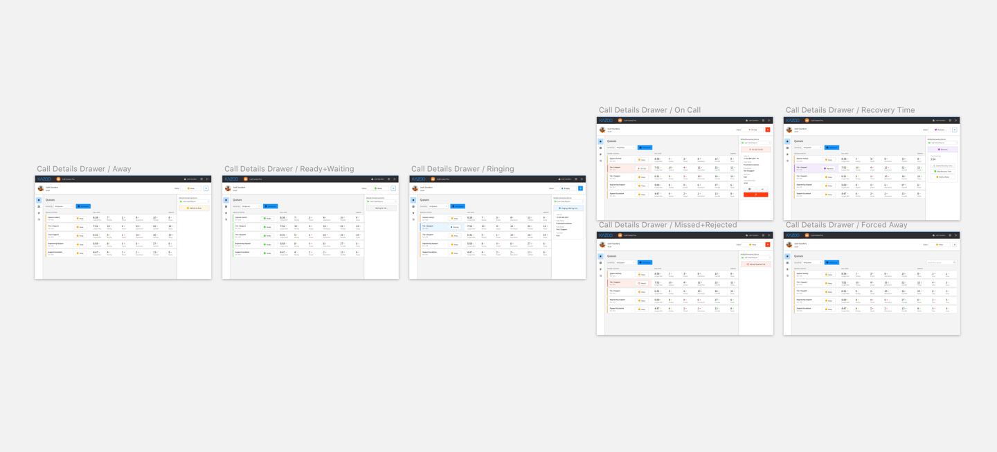
Due to the fact that the call details were only relevant when there was an active call, I decided to handle the call details as a side-drawer component. It would be hidden and out of the way when there no call was active, but would slide into view when the agent was receiving a call. This would help bring the incoming call to the user's immediate attention.
[Improving the manager experience]
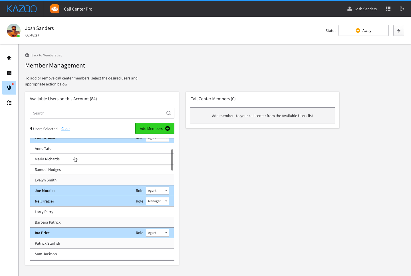
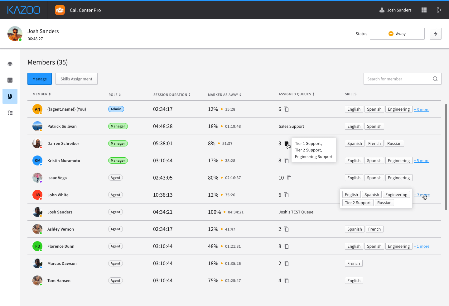
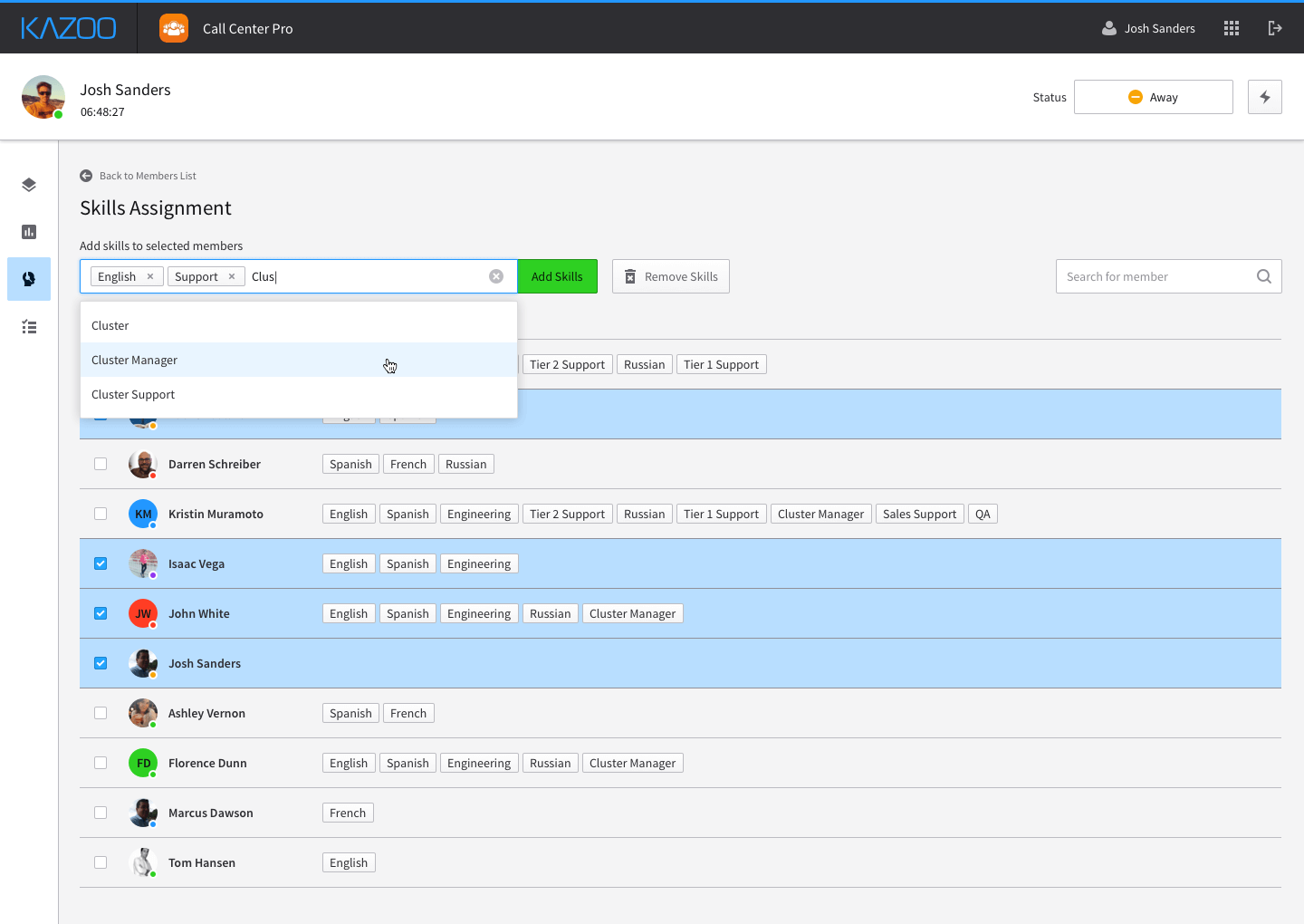
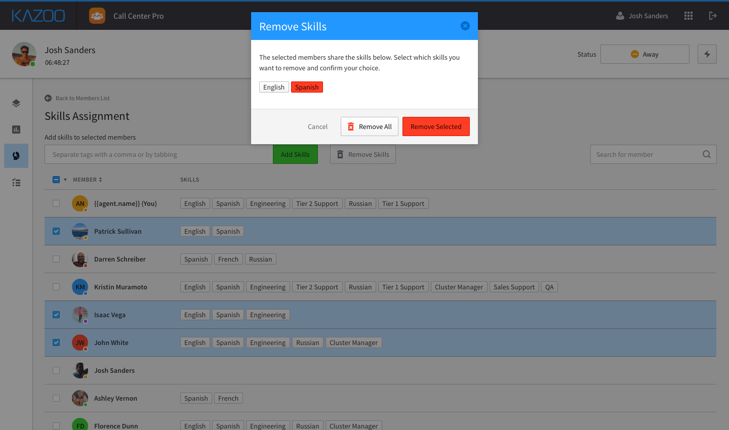
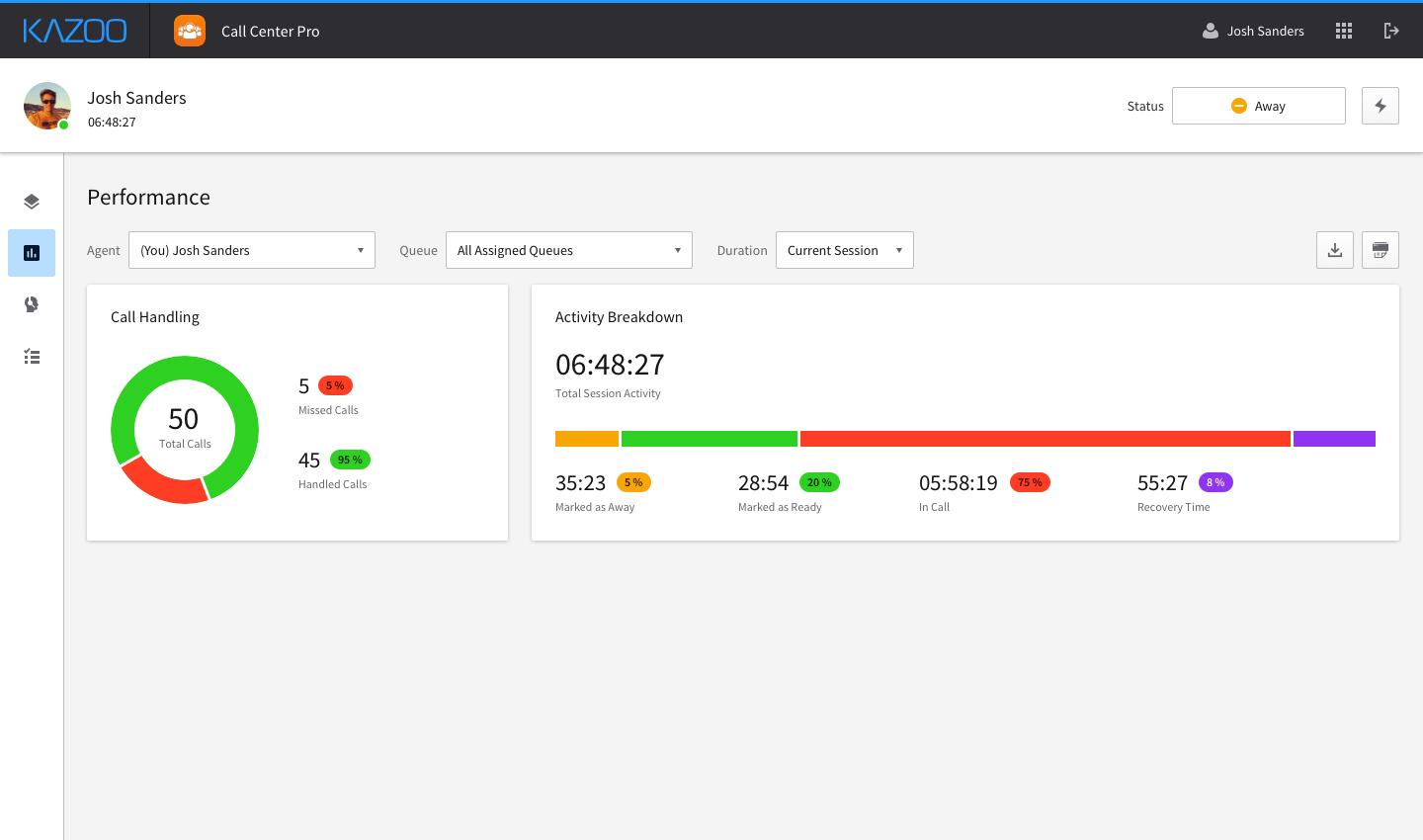
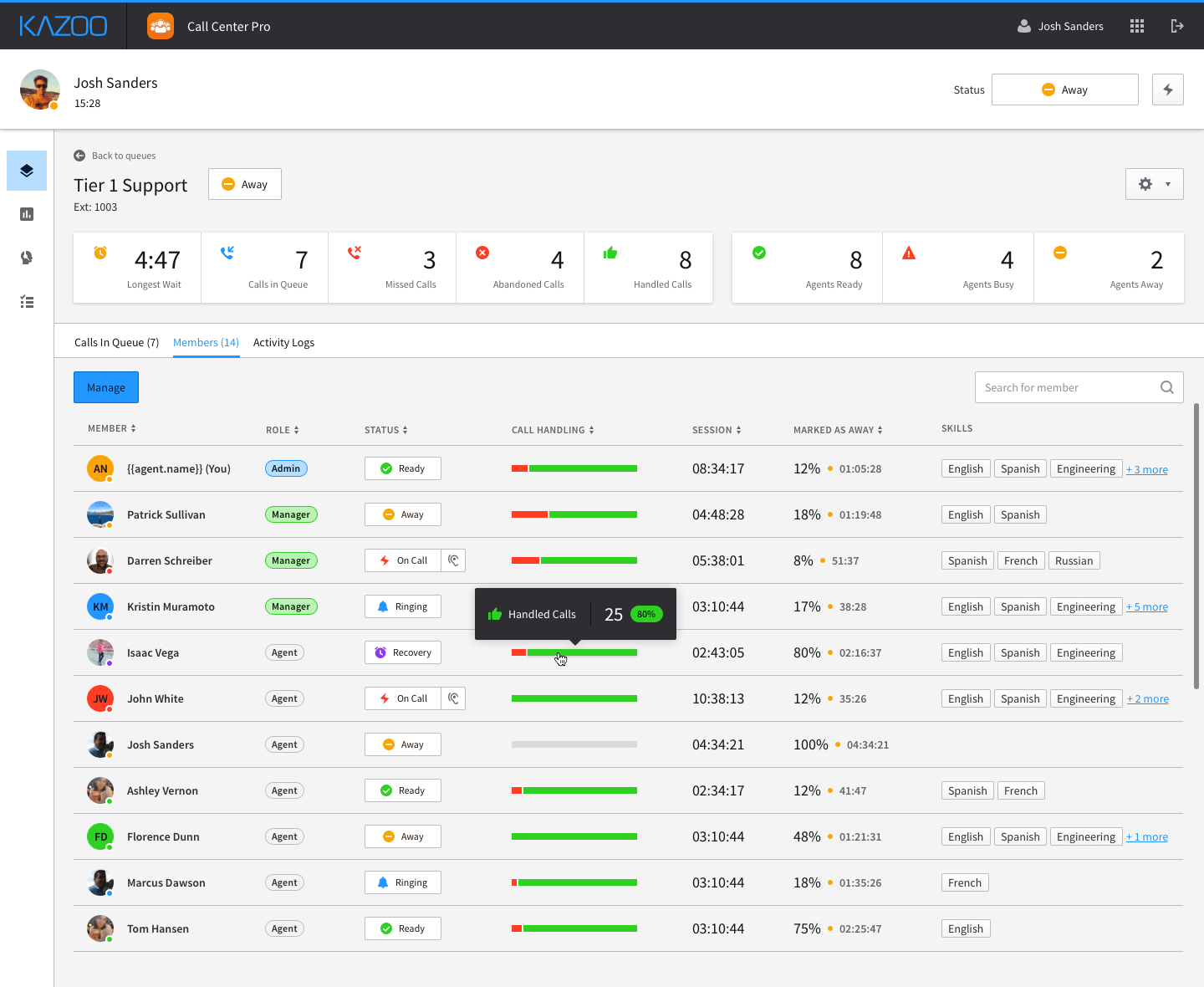
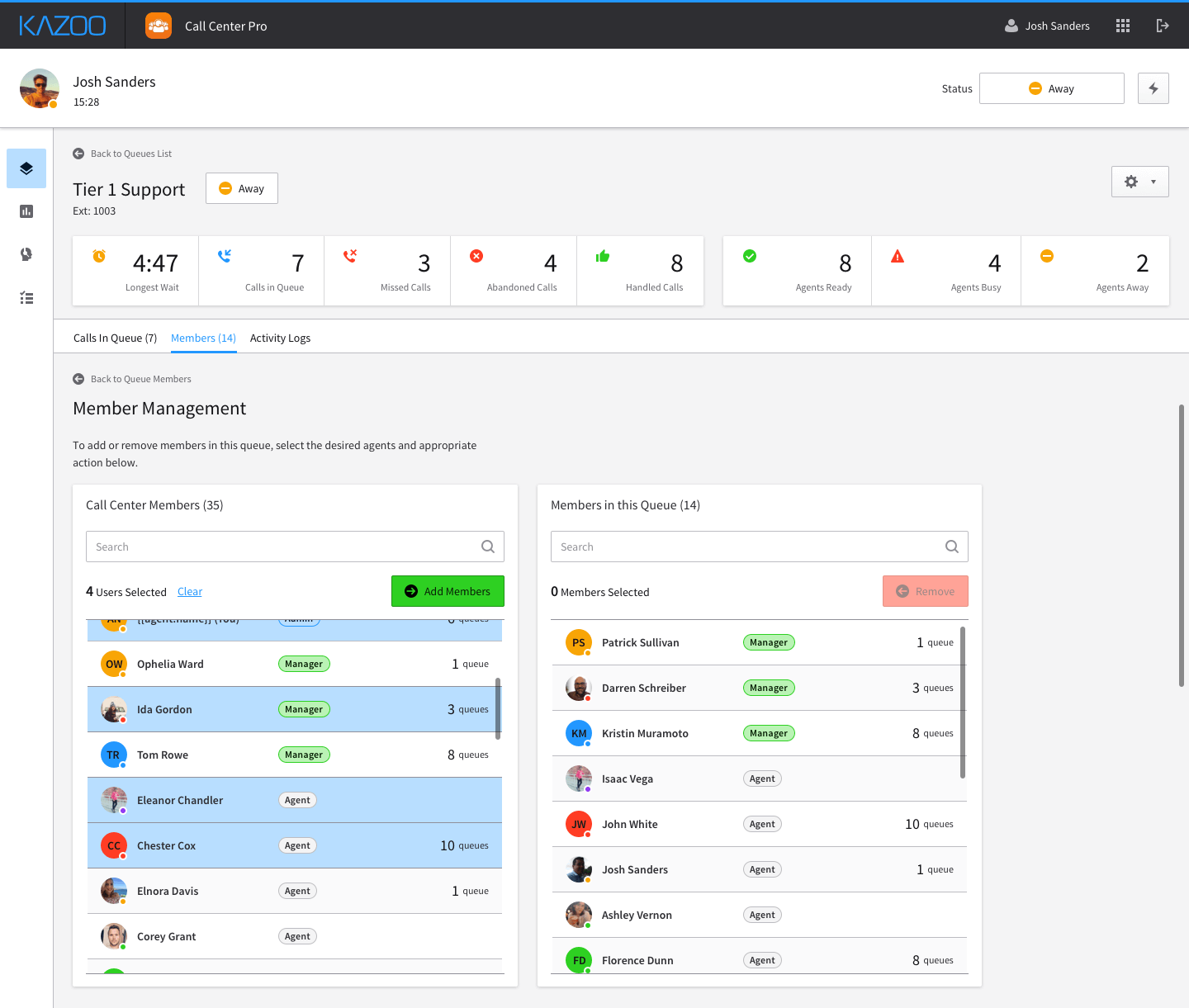
A large portion of the feedback we received focused on improving enablement for call center managers. The initial alpha version lacked performance reporting features, and member management was extremely rudimentary. One of the largest changes in terms of experience was a new concept of call center 'Members'. Originally, System Admins would select from a list of users on an account and assign them to a queues. With the new experience, System Admins would first add users from the system as Call Center Members. From there, members could be assigned an agent or manager role, tagged with skills, and assigned to queues.
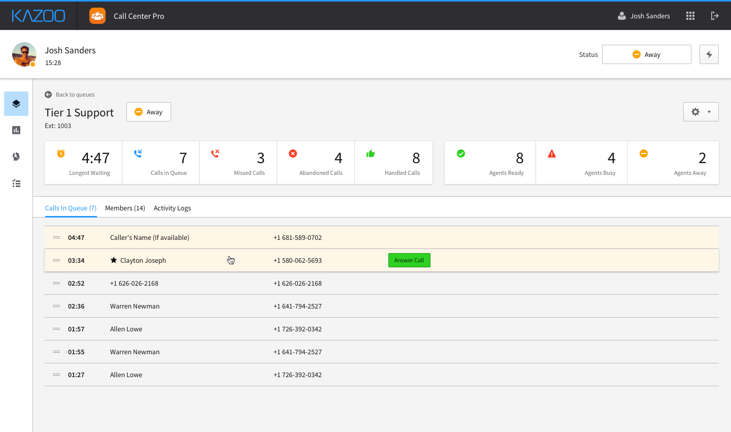
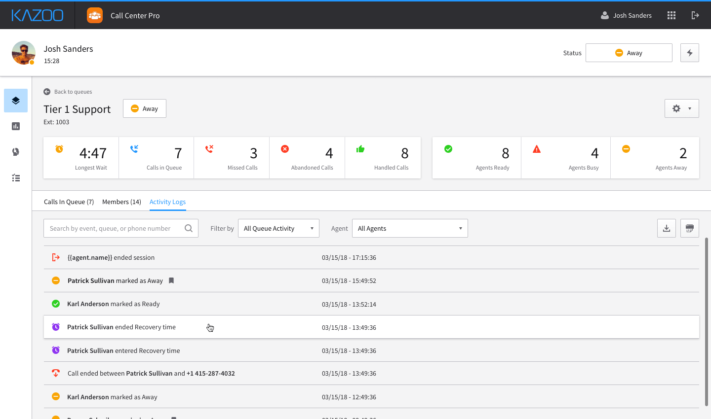
The alpha version listed queues as accordion-style components, which could be expanded to see queue members. This was fine for use-cases that had a handfull of agents in a queue, but was not a scalable solution for larger instances. To address this, I removed the accordion interaction and created a new view aptly named Queue Inspect. This view gives any user who is interacting with a queue a HUD display of critical stats, a list of all current calls, all members who are assigned to that queue, and in-depth activity logs for tracking and error reporting purposes.
[Revisiting queue creation]
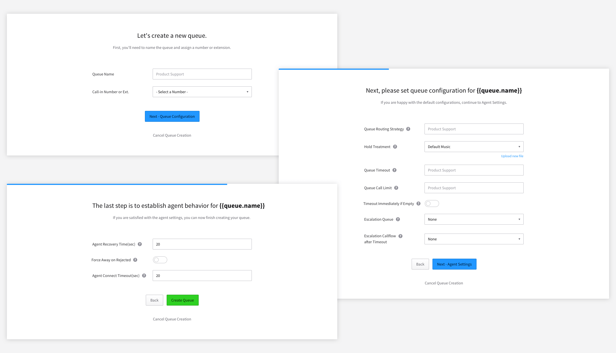
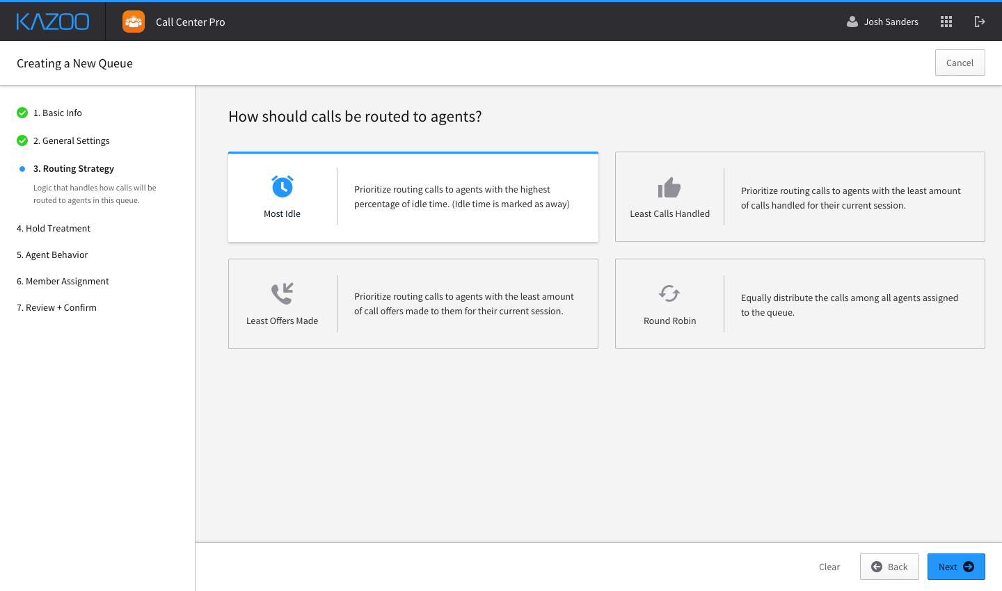
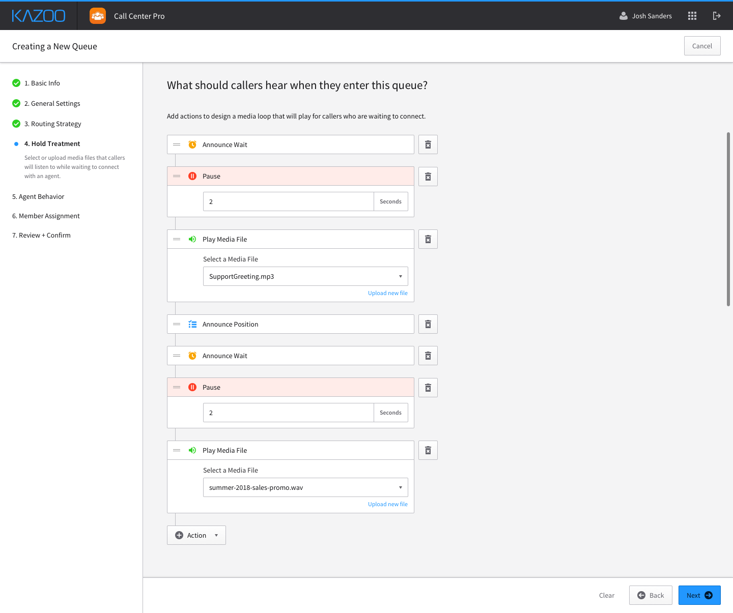
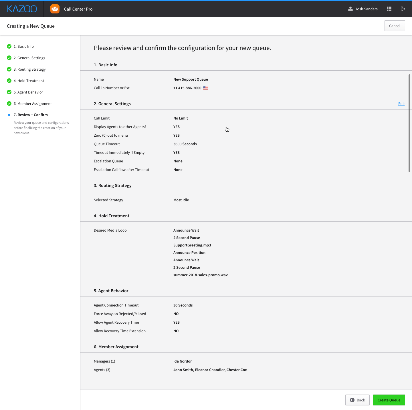
In order to improve the experience of setting up and configuring a call center, I revisited the queue creation wizard for System Admins. In our alpha version, it was treated as a simplified 3-step wizard. It offered very little supporting information on how settings affected the rest of the queue and its associated members. Additionally, we were adding multiple new configurations to queue options, so we needed to rethink the creation steps.
[PROJECT STATUS]
This application is currently entering a new development cycle to implement all of the changes and design updates, with the goal of releasing the updated beta version sometime in Q3 of 2018. From there, we plan on conducting more client testing and feedback sessions, and will iterate accordingly. New features in the planning phase consist of adding skill-based call routing to queue configuration as well as SLA performance tracking to further enable managers.
- Chris Kerber (Product Manager)
- Mark Magnusson (Engineer)
- Karl Anderson (CTO)