2600Hz identity
Updating 2600Hz’s corporate identity to better align with company objectives, messaging, and industry positioning.
- Brand Strategy
- Identity Design
[OVERVIEW]
In mid 2015, 2600Hz was nearing the end of a large restructure in product marketing due to the release of 2 new products. With these new offerings, the company was moving to solidify its position as a leading innovator in the telecom space. However, marketing & branding strategies at the time were struggling to convey this.To further compound the issue, 2600Hz's visual identity had become stale in the wake of evolving business objectives, marketing strategies, and brand voice. I realized that an identity refresh would further help in our company's repositioning efforts. However, when I first pitched the idea of an identity refresh, I was met with skepticism and resistance.
[AUDITING THE CURRENT IDENTITY]
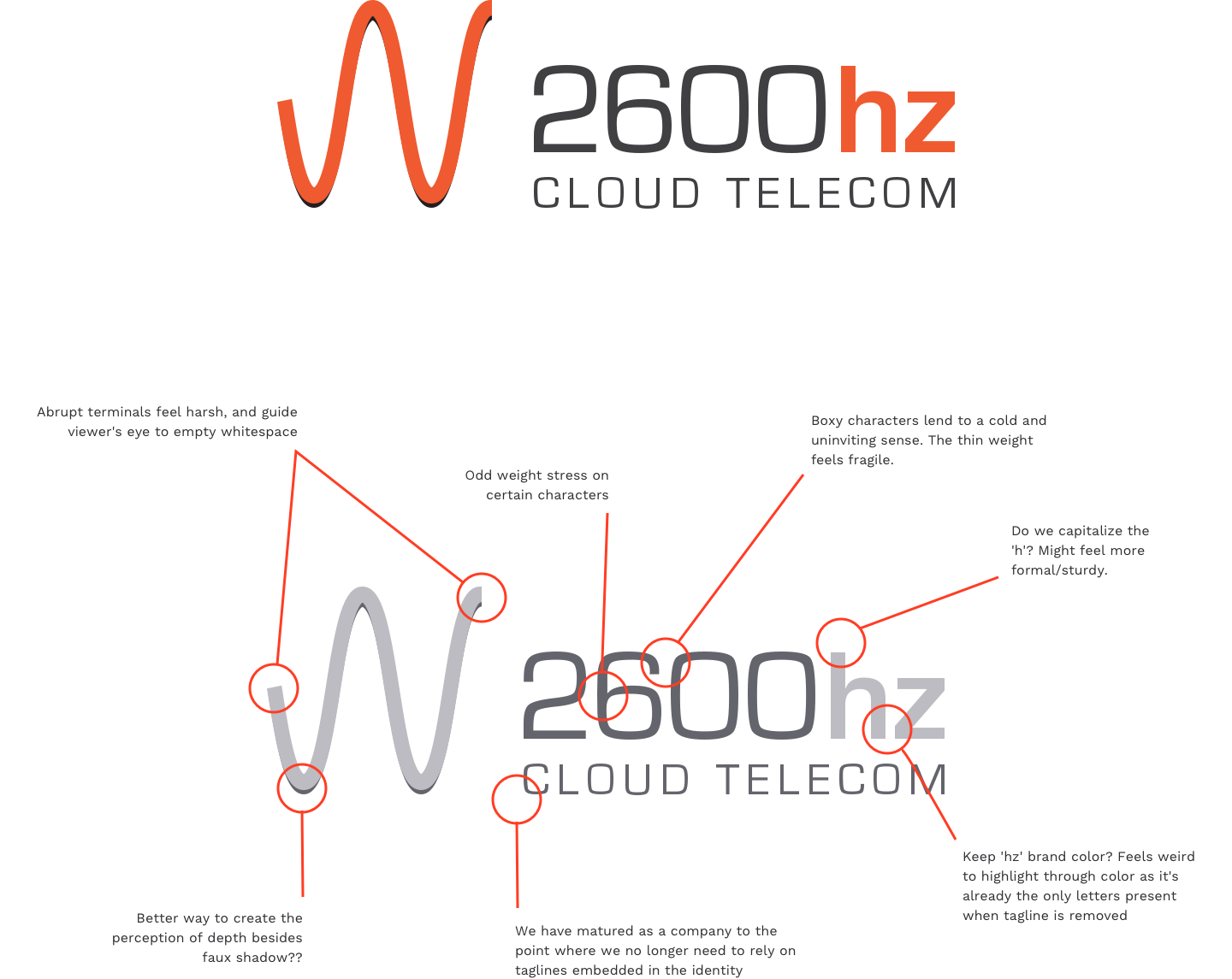
2600Hz's identity at the time was a literal reference of an analog audio wave. It felt flat and uninspiring for a company who's a lead innovator in the telecom technology space. The typography was a slightly customized version of Eurostile, designed by Aldo Novarese in 1962. Characterized by boxier, slightly rounded letterforms and quirky weight shifts(noticeable in the '6' and the 'h'), the wordmark felt fragile and overshadowed by the symbol.The symbol itself also had some issues, and came to be referenced internally as the 'W'. The terminals on each end felt abrupt, increasing visual tension. Visual alignment was also an issue, as the 'W' tends to lead the viewer's eye to the empty whitespace around the wordmark instead of the company name.Another issue I wanted to address was the tagline embedded within the identity itself. An artifact from the company's earliest branding efforts, I questioned the need for the 'Cloud Telecom' tagline. It added little to no value and was a narrow representation of what 2600Hz had grown to represent. The extra words also increased tension as they crowded the wordmark and forced the viewer's eyes to work double-time to identify letterforms. Lastly, it often presented scalability issues.I presented an extensive report to stakeholders outlining my issues with the current identity, relevant points of interest, and potential concepts that could be explored. After some persuasion and compromise(I bargained my way UP to a 3 week deadline), I received the go-ahead from stakeholders to move forward on a full identity refresh.
Working with the brand on a daily basis for years allowed me to develop an intimate understanding of it.
[RESEARCH & CONCEPT DEVELOPMENT]
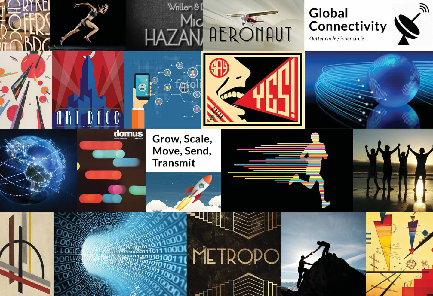
I kicked off the project by collaborating with team members in defining brand values, key words, and objectives that the new identity should successfully fulfill. In conjunction, I began curating a brand audit of Telecom and related industries, and an important detail presented itself immediately.The sample below is a tiny portion of brands within telco related spaces, yet visual metaphors for 'waves', 'signals', and 'networks' are present in almost every identity. The industry had become oversaturated with these visual references, and as such, I wanted to avoid if possible. I had only one other rule to which I would stand firm—absolutely no use of a cloud in the identity. It was yet another visual metaphor that suffered from severe overuse, and my goal was to elevate the 2600Hz identity, not cheapen it.
Visual metaphors of waves, signals, clouds, and networks can be found everywhere.

I collected inspiration and reference imagery that resonated with our new brand values/keywords. I have always been intrigued with abstract modernism and artists such as Wassily Kandinsky. The movement he acheived in his work using simple lines and shapes resonated with some of our key words/verbs such as send, transmit, move, and scale.
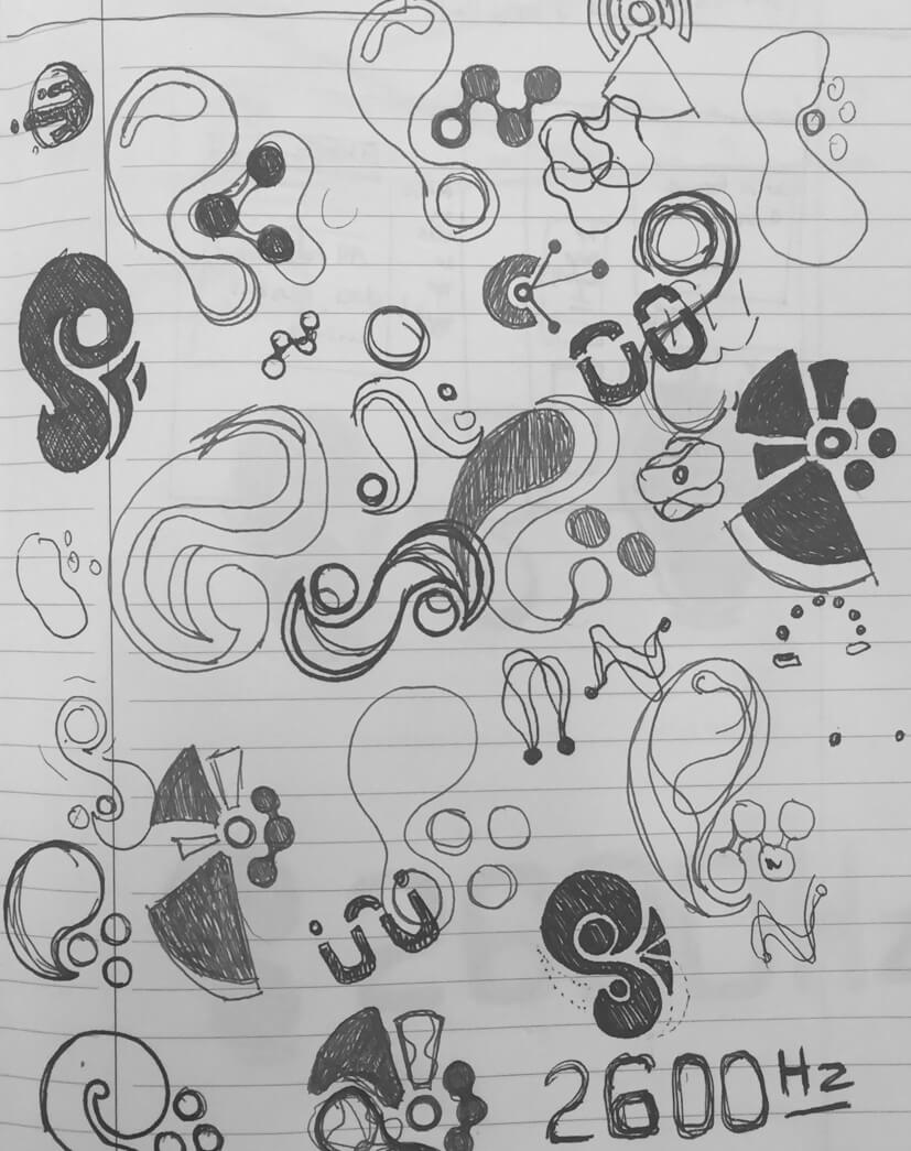
Initial brainstorming and sketching.
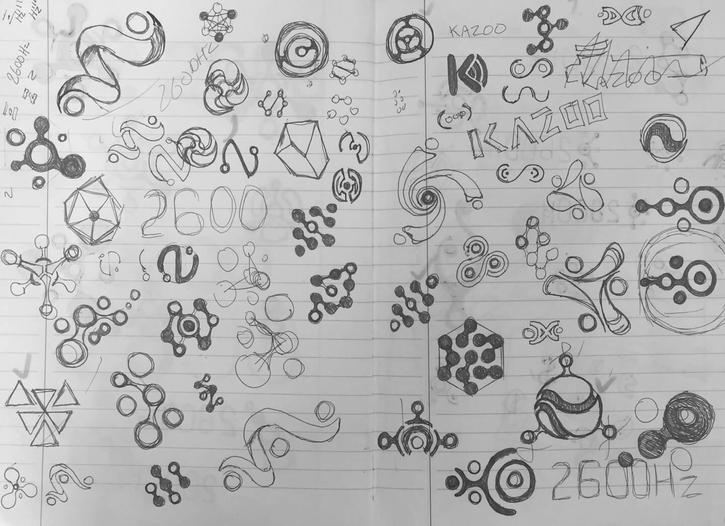
Rough computer explorations

[CONCEPT REFINEMENT]
As I narrowed in on certain aesthetics, I found myself revisiting one keyword in particular: transmission. In modern telephony, we communicate through transmission of signals. An analogue wave was a far cry from portraying that. I started experimenting with the concept of signal transmission and how it is actually achieved today. As I iterated through this idea, the results became increasingly filled with the sense of motion. At that point I felt confident that the identity was headed in the right direction.

[CUSTOM WORDMARK & PROPORTIONS]
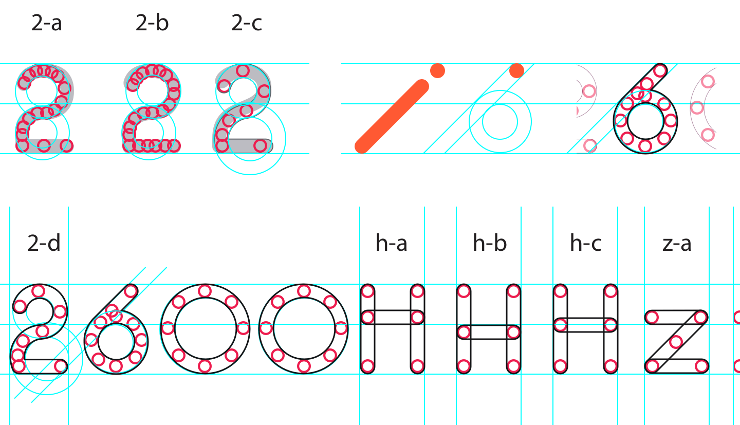
After testing various typeface and style pairings with symbol variations, I decided to create the wordmark from scratch. This allowed me full control of the exact proportions and alignment, as well as tie the wordmark to the symbol through shared characteristics.I looked into typography trends during the early 1900s — a time when telephony technology was gaining momentum throughout general society. During this time, the creative movement known as 'Art Deco' was gaining momentum. Characterized by exagerated proportions and geometric letterforms, typography of the time contained a very strong aesthetic and could stand strong on its own. These characteristics served as inspiration as I was developing the type. To further strengthen the connection between symbol and wordmark, I used a small circle taken from the symbol to handcrafts each letter needed for the wordmark.
The '6' provided a great opportunity to visually connect the symbol and wordmark through the 45deg angle.
[FINISHING TOUCHES]
2600Hz also has a thriving open source community, and as such, the old identity system contained a version for open source attribution. This is something we wanted to retain from the old identity, so I implemented a secondary open source logo to meet this need. Once the new identity was packaged and ready for handoff, I created a v1.0 of Brand Guidelines and worked with our Marketing Designer to develop a first iteration of a stationery system(Biz Cards, Letterhead etc). After an intense and challenging three weeks, it was time to introduce the new 2600Hz to the public.
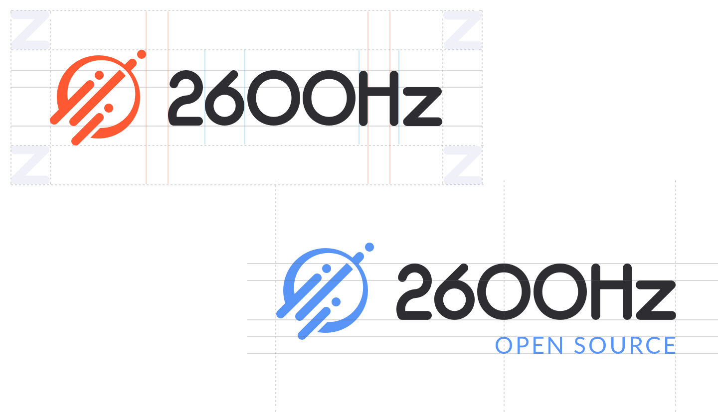
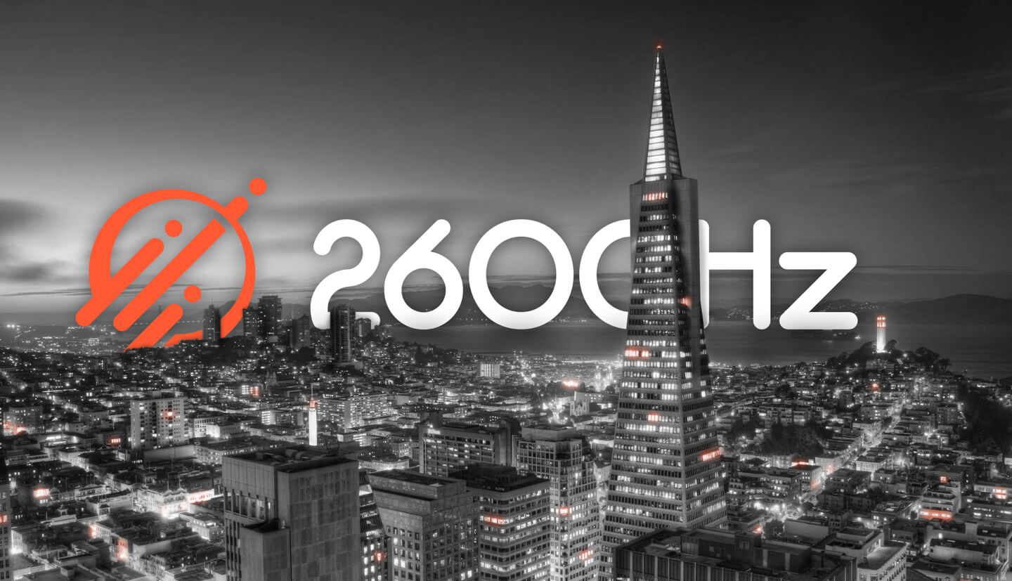
Photo Credit: Jay Yoder
[PROJECT STATUS]
We launched the new 2600Hz identity in Q2:2015 to an overwhelmingly positive response.
- Jay Yoder (Marketing Designer)